Midland Industries
For Midland Industries, America’s largest industrial supplies distributor, I led a holistic redesign of their online presence and e-commerce platform, driving sales, customer acquisition, and user satisfaction.
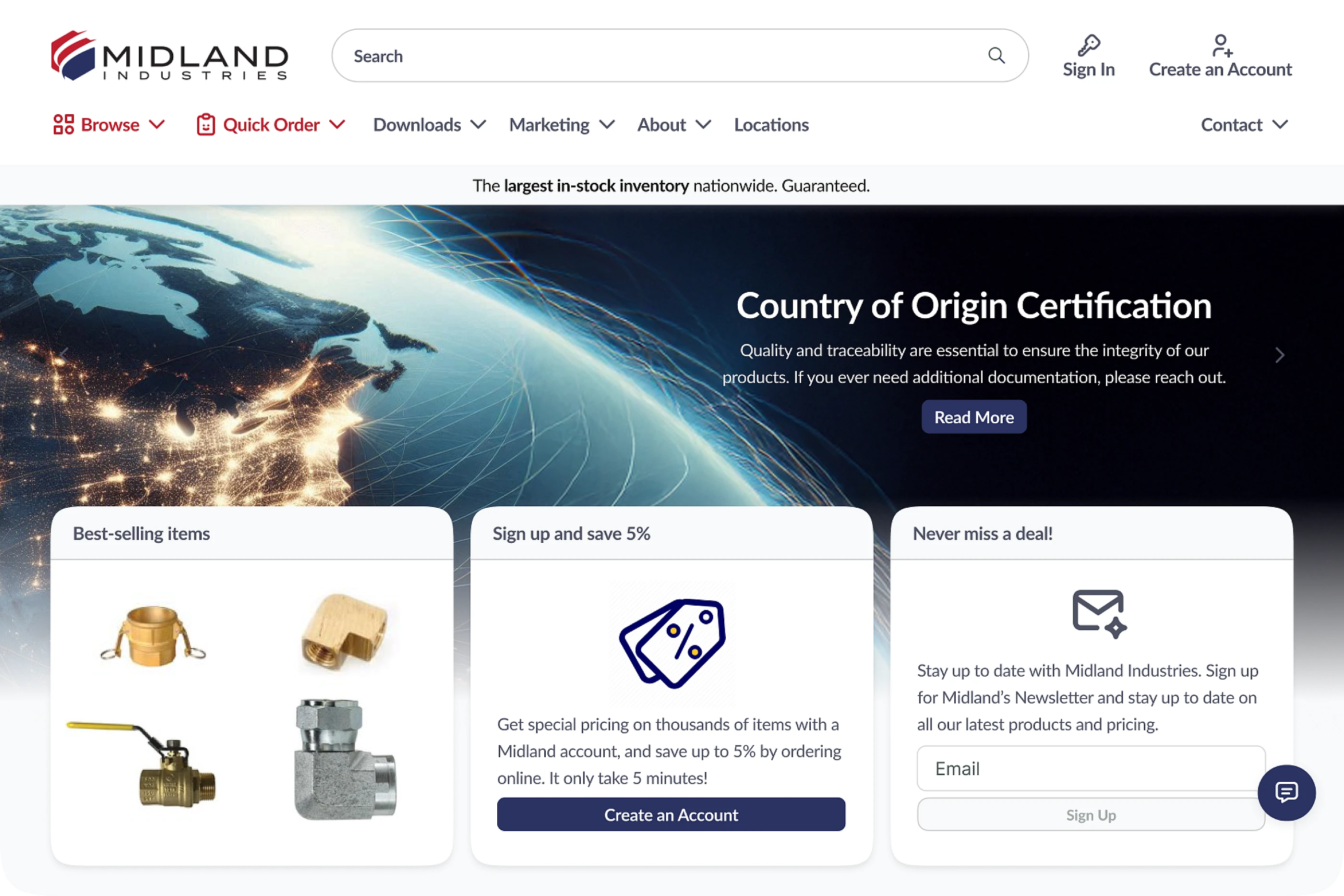
The new homepage design updated Midland's public face with a cleaner visual language, a reorganized and condensed header, and multiple points of entry for various customer use-cases, helping drive demand and repeat purchases.
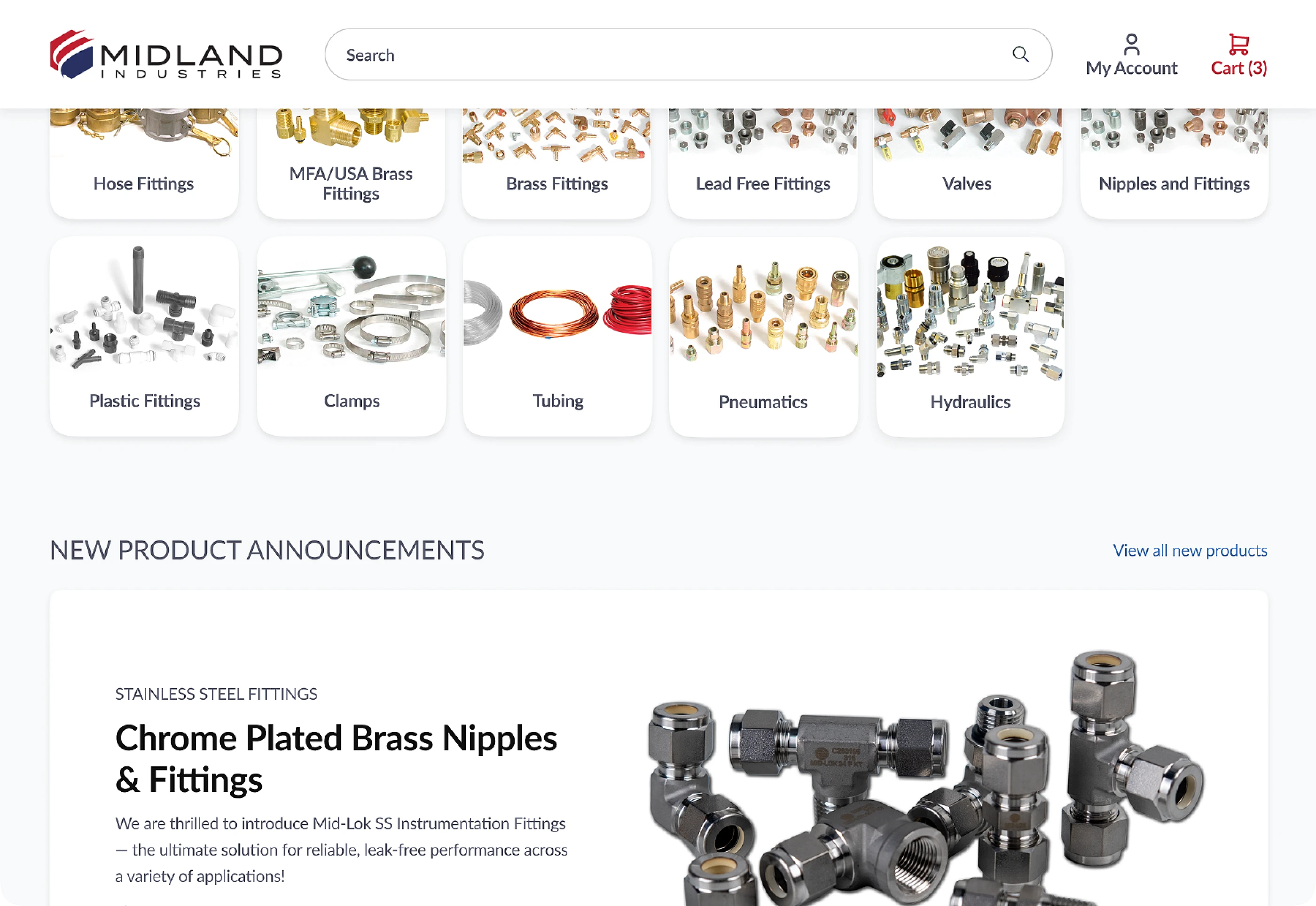
The header partially collapses on scroll, saving space. Popular product categories are surfaced visually in intuitive cards, building muscle memory for repeat customers. Dedicated space is given to new product announcements.
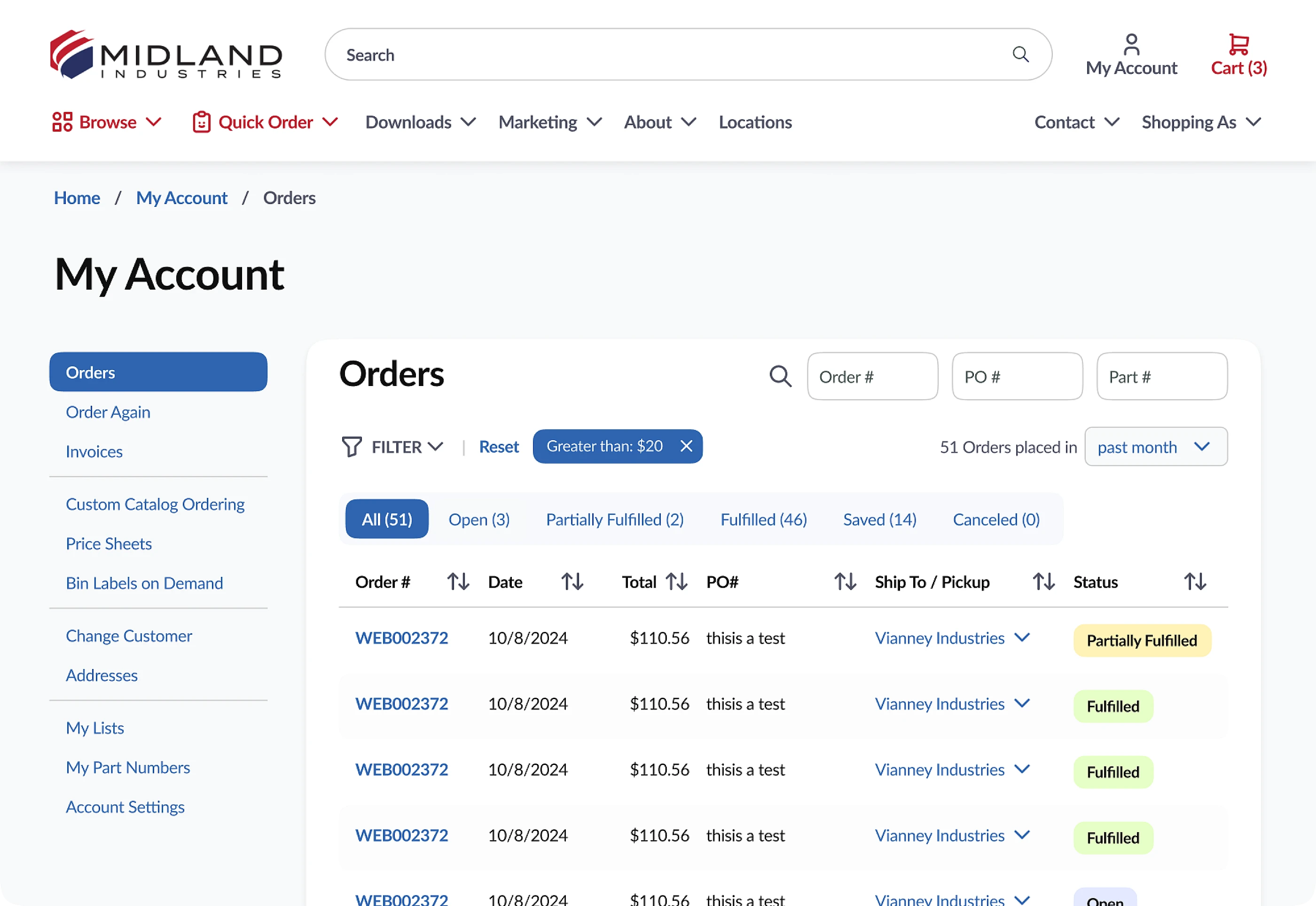
I interviewed 15 Midland customers, ranging from solo small business owners to dropshippers using Midland to fulfill orders for their own customers, and used the insights gleaned to drive substantial improvements to the shopping platform. Specifically, the My Account experience was significantly overhauled.
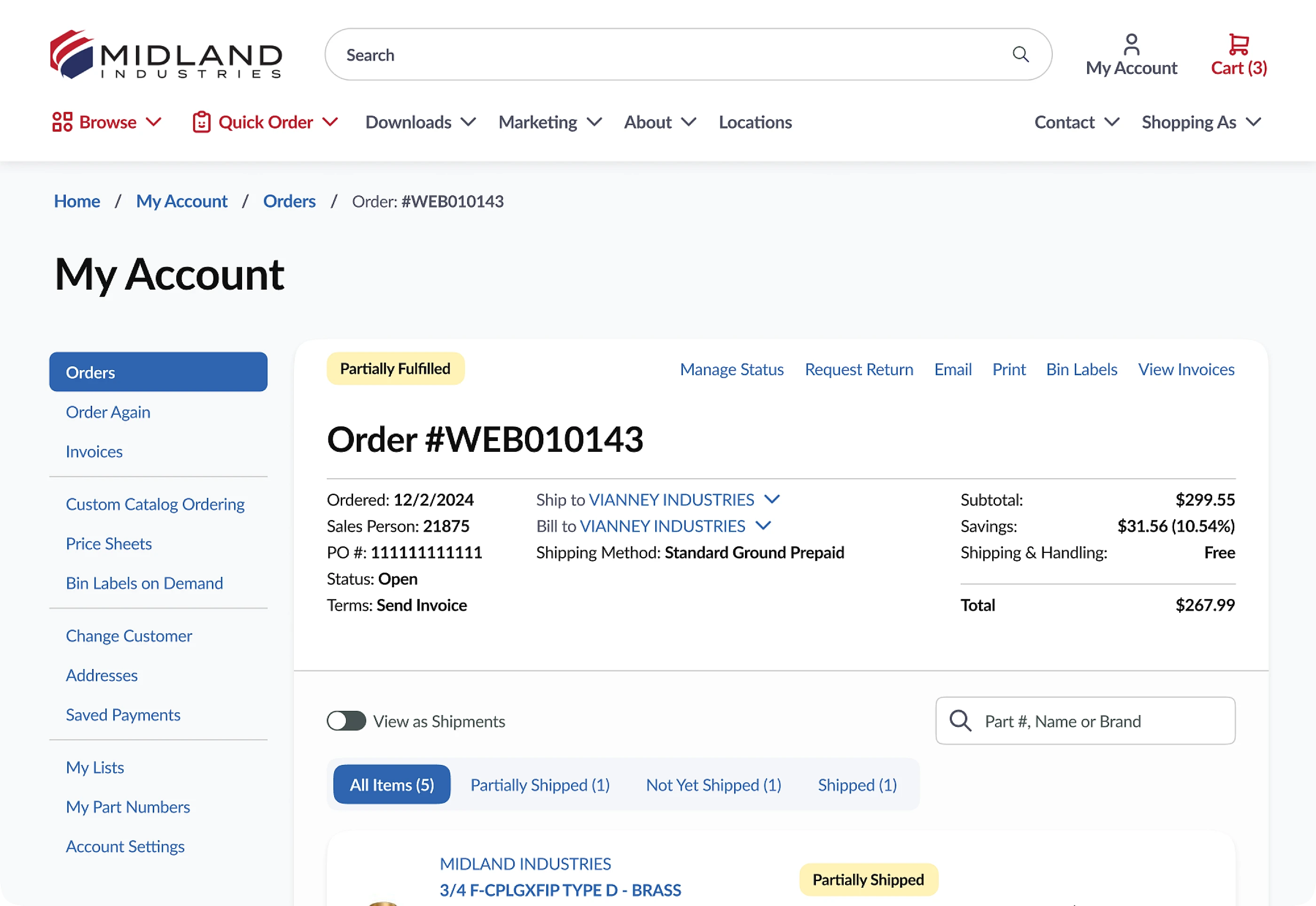
The redesigned Order page is much cleaner, affording users a streamlined experience when double checking Purchase Orders and making updates.
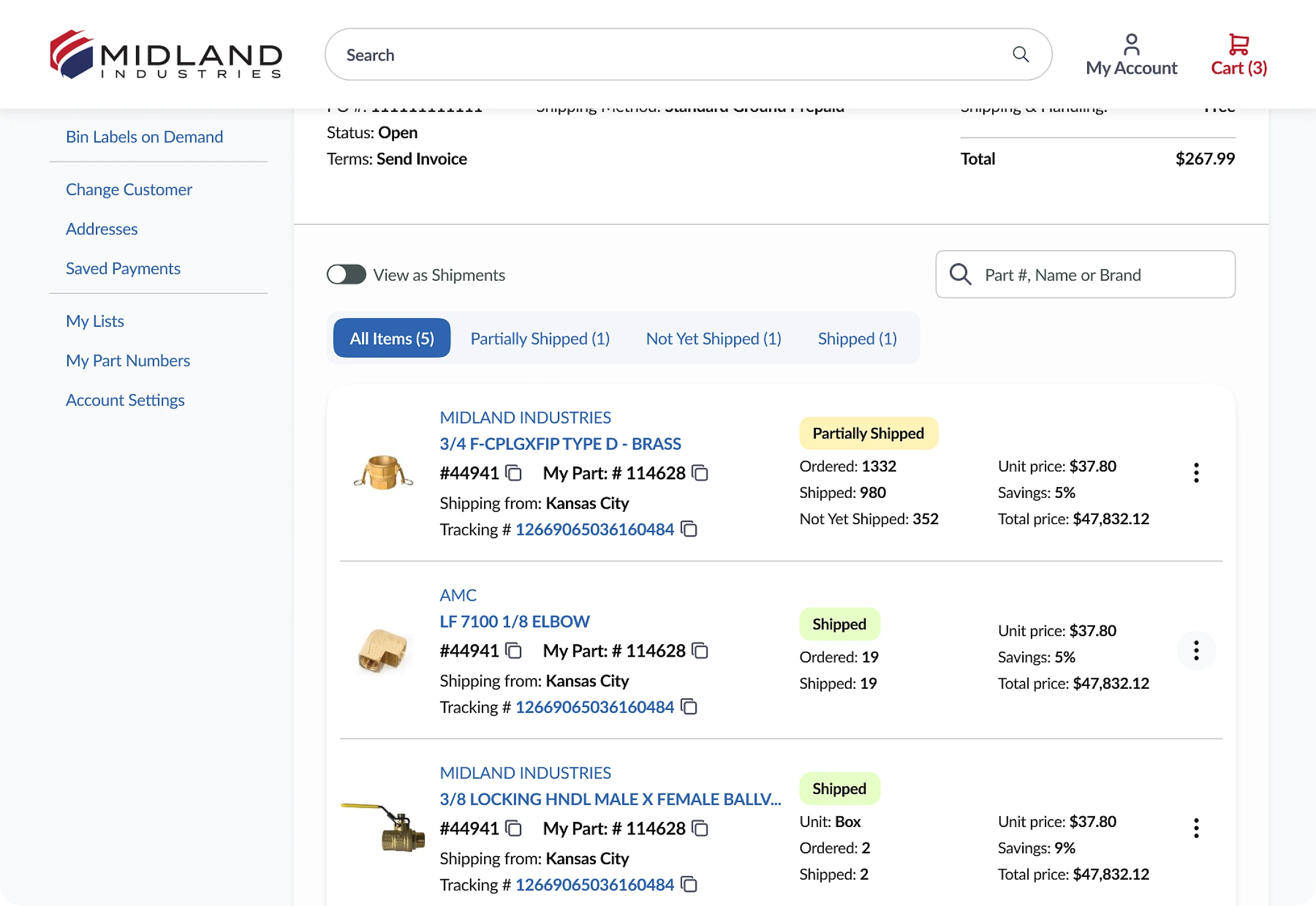
Items are listed in a compact yet scanable grid, with some powerful filtering options built into the UI, such as being able to group items by shipment.
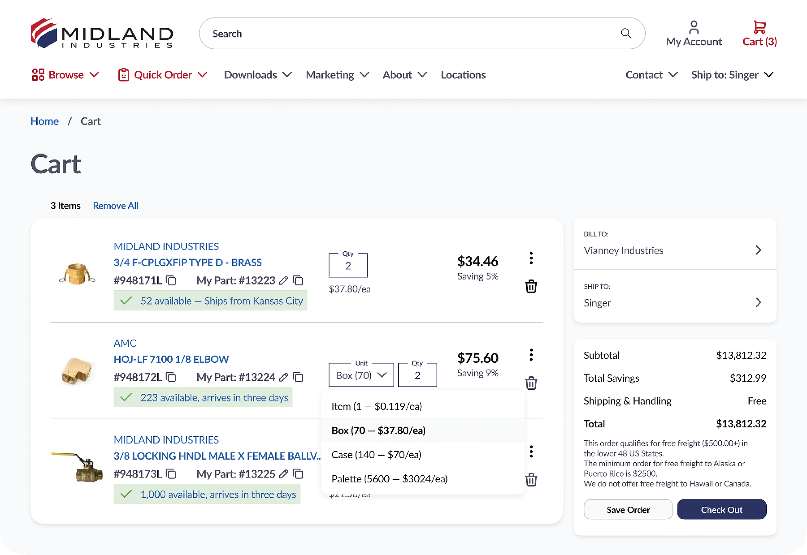
A totally redesigned shopping cart experience brought clarity, density, and increased functionality to the previous design (see deep dive section below).
Before & After
Midland had an existing website which my team was tasked to redesign, with the strategic goals of driving sales, increasing cart size, and encouraging existing customers to migrate to the new platform Midland had selected.
Below are some examples of areas of design focus, showcasing issues with the existing site and the solutions. Use the tabs to compare before and after.
Visual hierarchy
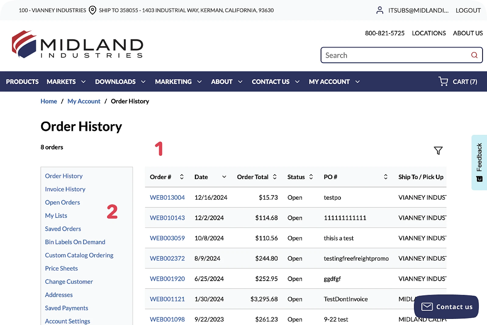
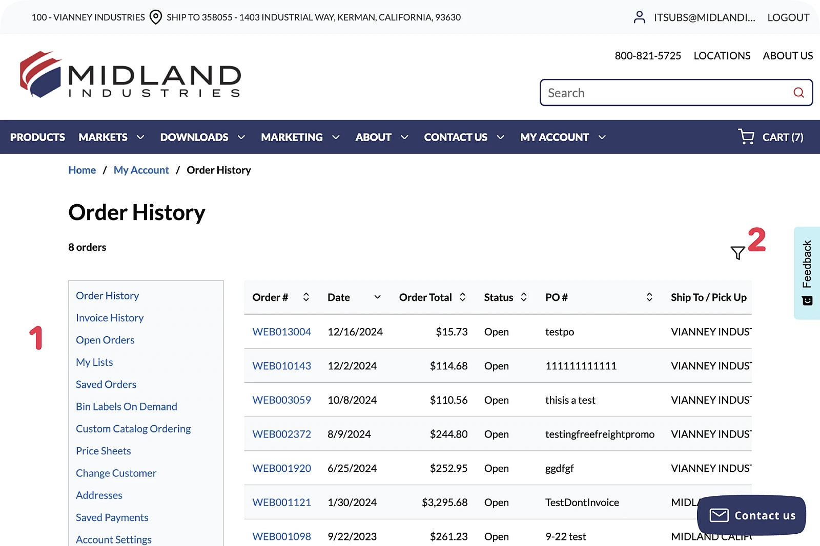
The existing 'My Account' experience lacked clear visual hierarchy, making initial comprehension and navigability challenging. Everything sat on a glaring white background (1), while the a confusing gray box of links (2) appeared to be a child element of the page (see 'Architectural Issues', below).
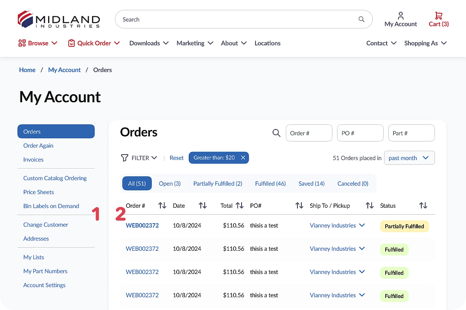
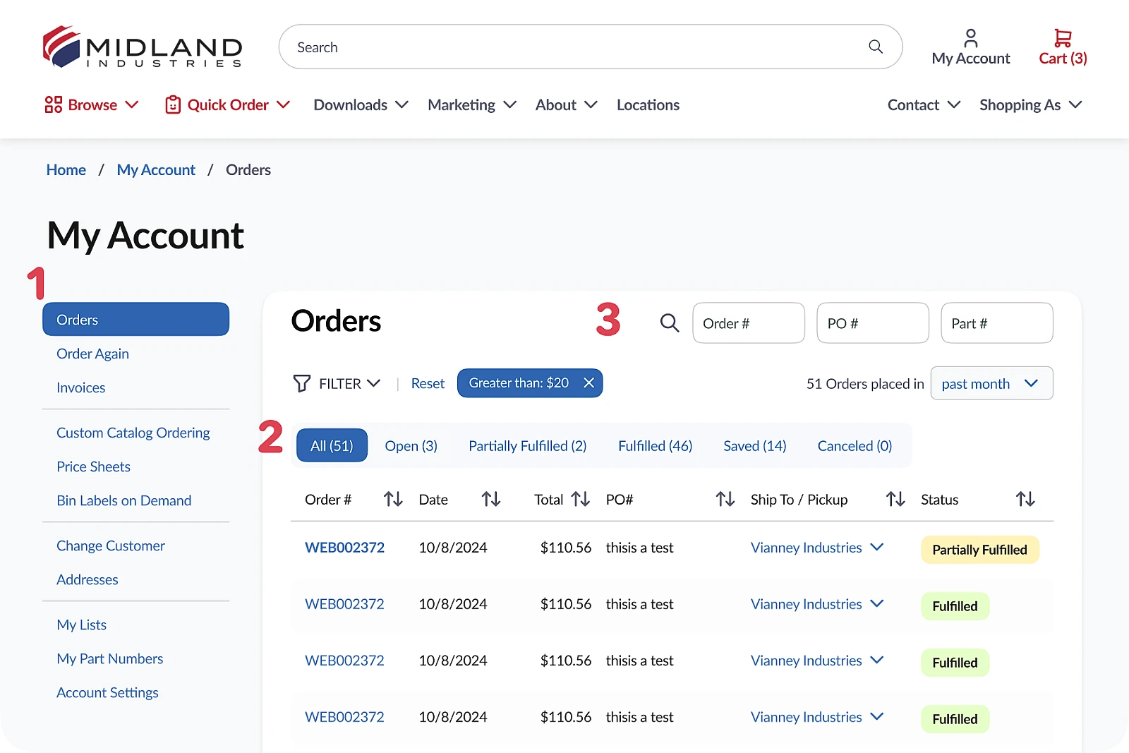
In my redesign, a soft grey background introduces a subtle shift in visual depth (1), separating the menu on the left from the ‘card’ of content (2) on the right, and restoring a parent > child relationship. This gentle visual hierarchy cue makes navigating the ‘My Account’ experience more intuitive, while lending a softer, cleaner presentation to the site’s visual language as a whole.
Architectural issues
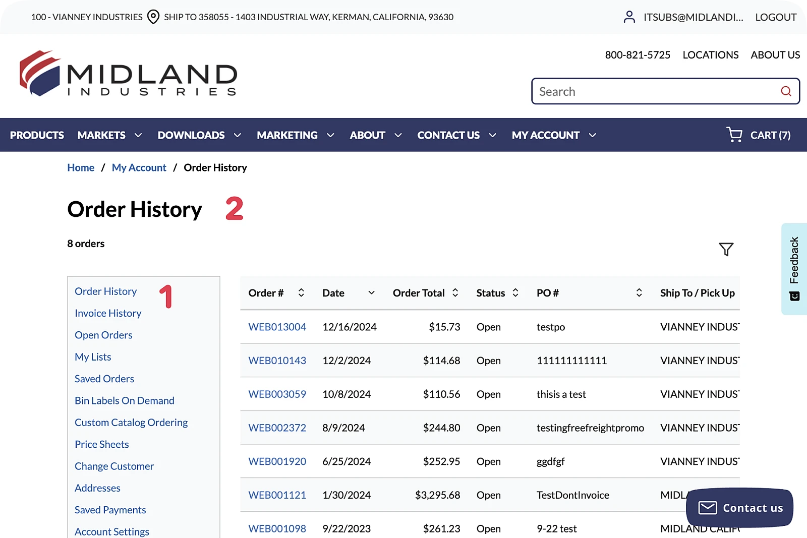
The confusing gray box of links (1) appears to belong to the current ‘Order History’ page (2). In fact, it should be a sub-navigation of My Account, with the first item active.
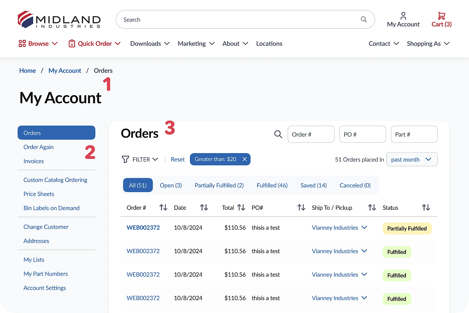
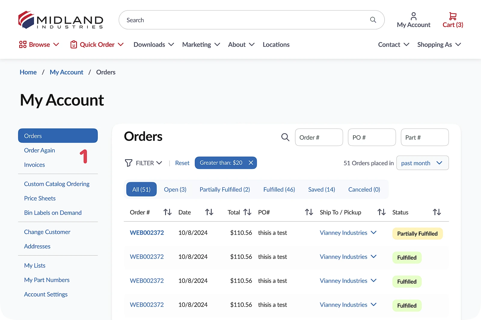
In the redesign, the page is now relabeled ‘My Account’ (1), making sense of the left-rail sub-navigation (2), which now shows the active item, ‘Orders’. The main content area of the page also gains a title (3).
Search and filter issues
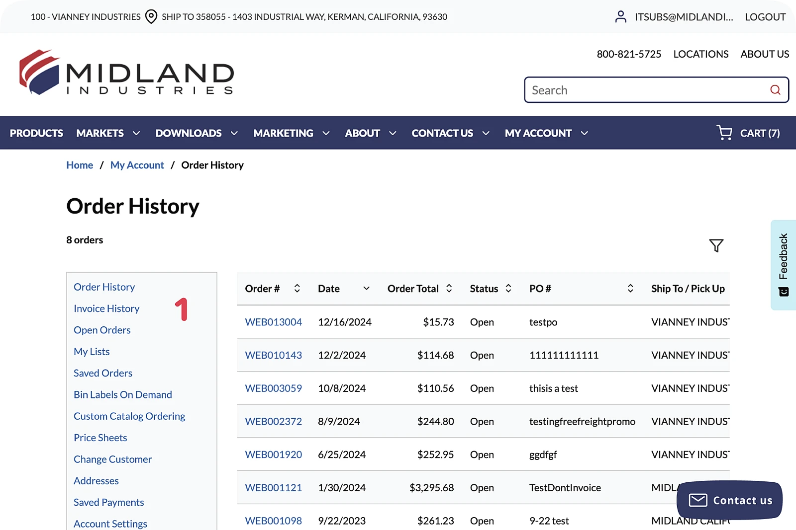
Different filter states of ‘Orders’ are presented as separate pages: ‘Order History’, ‘Open Orders’, ‘Saved Orders’ (1). This makes it impossible to search or filter across all simultaneously (2).
‘Order History’, ‘Open Orders’ and ‘Saved Orders’ from the old subnav are combined into the new single ‘Orders’ tab (1) as faceted sub-navigation (2). This allows for additional nuance such as ‘Partially Fulfilled’ status to be surfaced quickly, while also making search and filter possible from a single location (3).
Scanability
In the old design, scanning the contents of the navigation 'box' (1) is difficult due to the number of items and lack of ‘chunking’ into groups.
In my redesign, the new sub-navigation (1) introduces visual segmentation and a slight reordering for easier comprehension and scannability.
Shopping Cart UX/UI
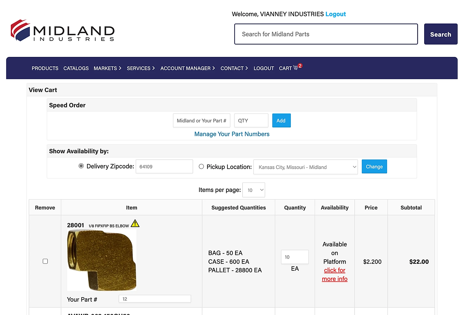
The cart design on the existing site was a functional yet very messy table-based design, resulting in visual sprawl that made it difficult to determine cart contents for larger orders.
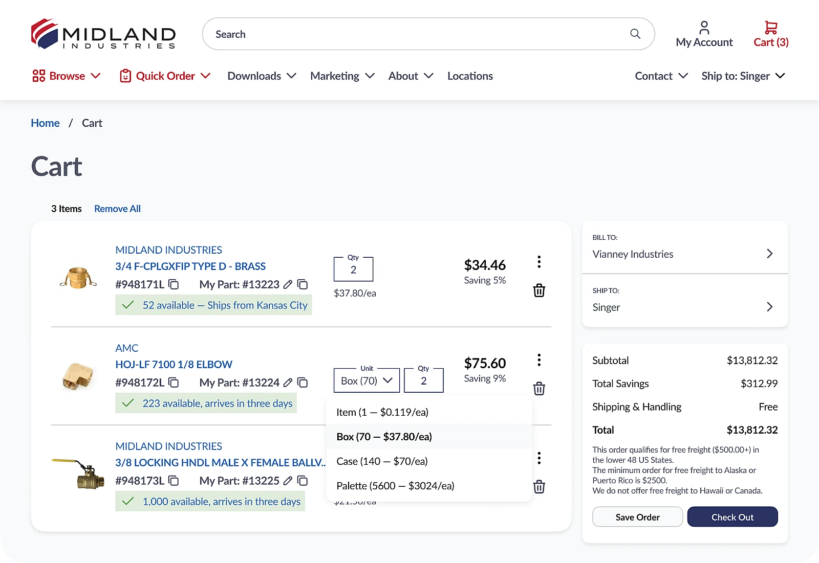
The redesigned cart is cleaner, more compact, and yet also more functional via some innovative UX. Certain items carry special bulk pricing for certain customers. These customers will automatically see the UI shown on the second line item, allowing them to specify the bulk unit. Selecting 'Item' seamlessly swaps the SKU for the non-discounted version, without the customer having to search for this smaller-quantity SKU manually.
Homepage
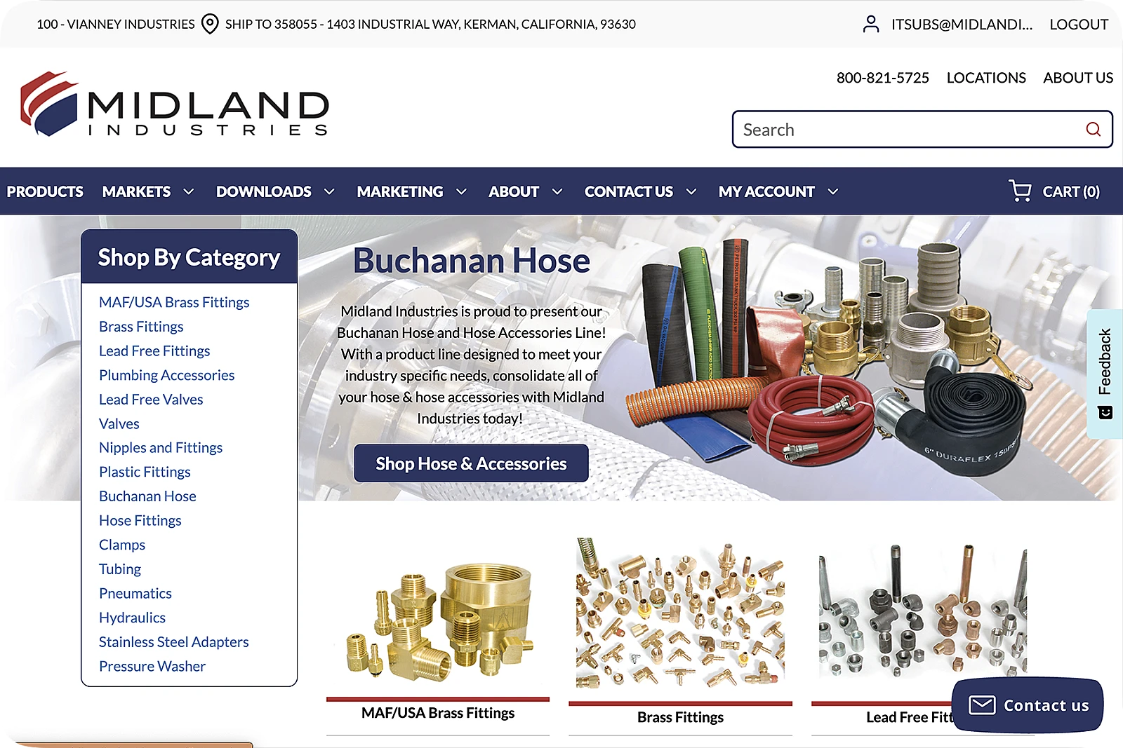
Visually cluttered, dated, non-WCAG compliant, lacking a personalization layer, and lacking any way of promoting new products, the existing home page had room for improvement.
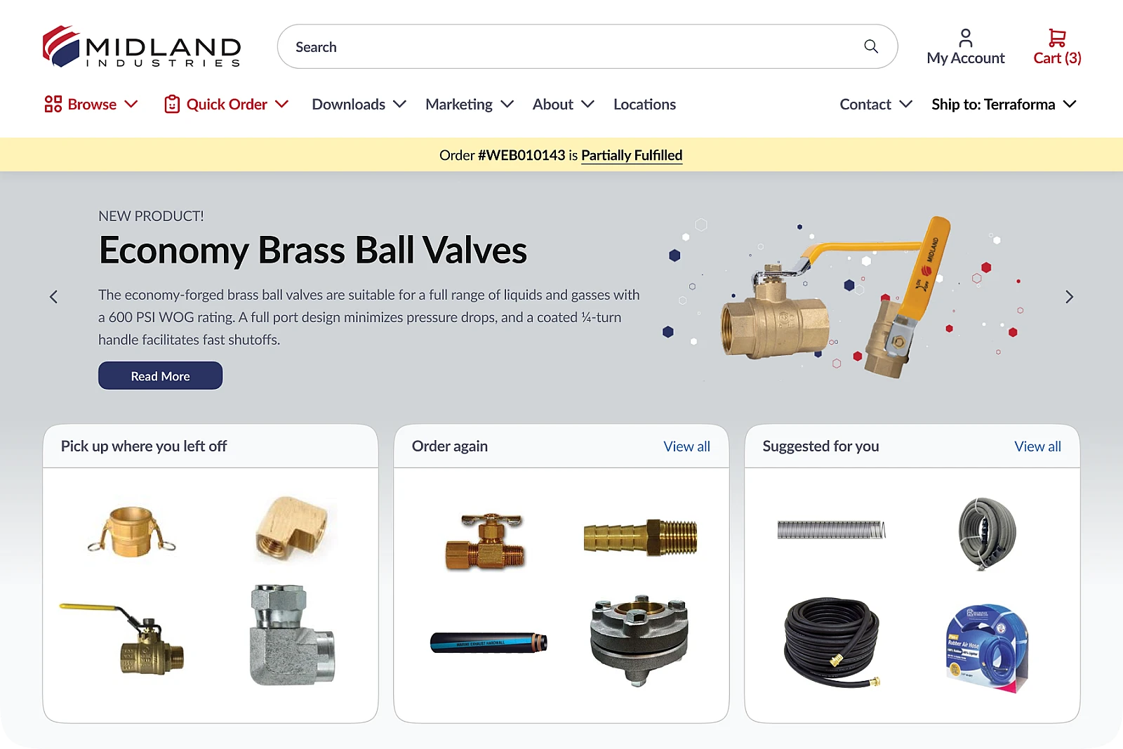
Stopping short of a rebrand, the redesigned homepage established a new visual lanauge of directness and simplicity, while featuring personalized entrypoints for different use cases ('Order again', 'Pick up where you left off') and dedicated spaces to drive demand for new products.
Industries
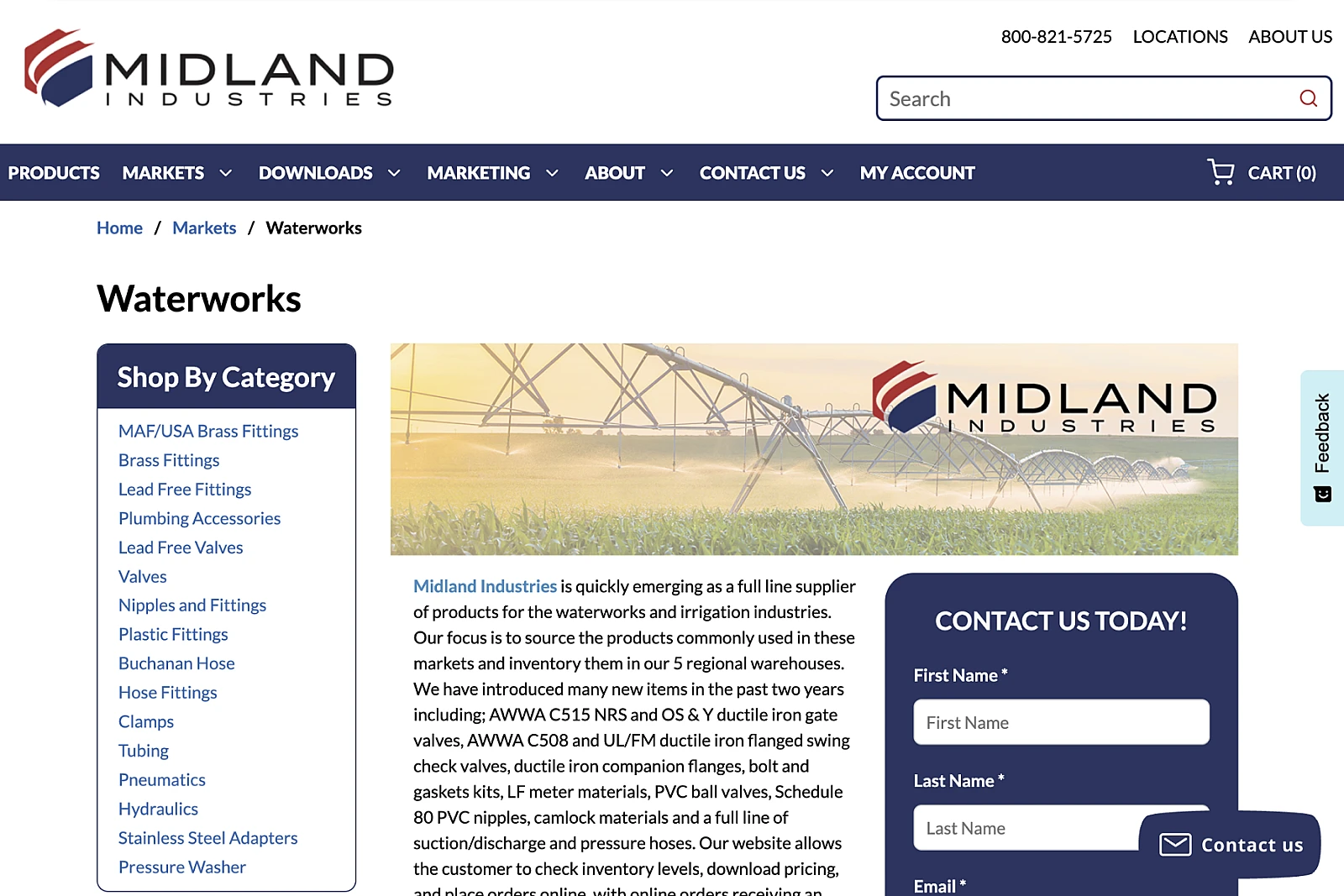
The page ostensibly dedicated to the Waterworks industry nevertheless features the full static list of product categories down the left hand side of the page, while the main content of the page is overly-long textual copy and an awkward contact form. The Midland logo is also redundantly duplicated in the image.
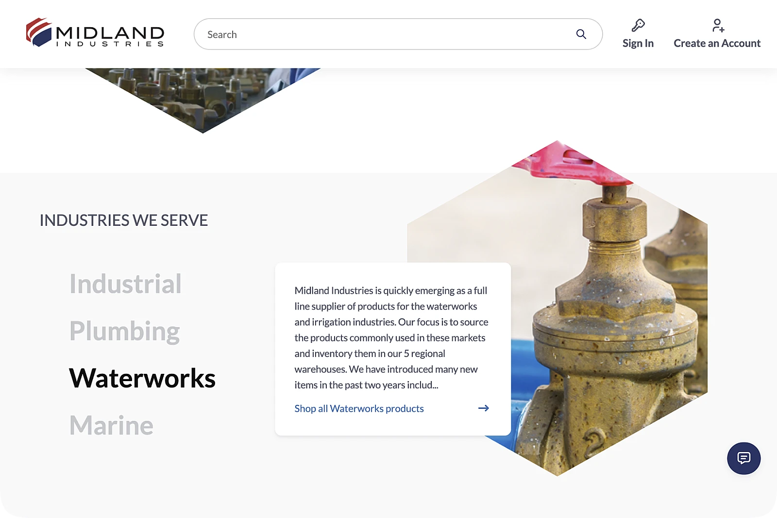
Taking visual cues from the logo shape, the industry images are presented alongside revised text copy in a simplfied selector UI which allows the user to filter product categories to those specific to this industry.